Credit Strong: Revolv Post-Launch Improvements
As the UX Lead at Credit Strong, I had the privilege of steering the design efforts for innovative financial solutions. My daily activities varied widely; I would alternate between overseeing the crafting of visually appealing and user-friendly screens and plotting strategic pathways for our forthcoming products and features. A key highlight of my tenure was the successful launch of Revolv, where I played an integral role in overseeing the entire design process. This involved facilitating constructive feedback sessions with leadership and collaborating closely with the Director of Product, ensuring a seamless transition between UX designs and the development team’s implementation.
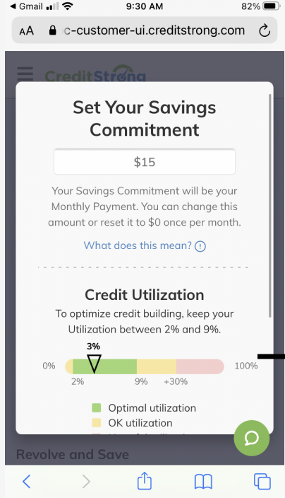
1A Orginal Design based on Requirments given
This screen waS VERY PROBLEMATIC. WE OBSERVED A SIGNIFICANT NUMBER OF USERS FALLING OFF, OR COMMITTING TO 100% UTILIZATION
What is Revolv?
Revolv is a unique financial product that empowers customers to achieve two significant outcomes simultaneously:
1. Secure a $500 revolving line of credit.
2. Incrementally save cash with each payment they make.
Unlike a traditional line of credit that provides immediate access to the full amount, Revolv adopts a more balanced approach. It allows users to access only the amount that corresponds to their monthly savings commitment. Each payment made by the user goes directly into a locked account in their name, enabling them to build savings over time. At the end of the loan term, every dollar saved is returned to the user, promoting responsible financial behaviors.
Revolv not only reports as a $500 line of credit to credit bureaus but also positively impacts credit utilization by offsetting the total amount. Our intention with the savings commitment feature is for users to select a monthly payment ranging from $10 to $45, which effectively maintains their credit utilization between 1% and 9%. This is the screen we will focus on in this case study. It is the most critical screen, and the business is not allowed to tell the user what amount to select. This restriction can make navigation tricky, as we need to help customers make the right choice without providing direct answers.
Pre Launch Discovery
Revolv would be the first new product I would work on at Credit Strong. This product fills a gap in the existing product line, allowing users to obtain a revolving line of credit. It is expected to become one of the company’s evergreen products and a primary revenue driver. After conducting research on other Credit Strong products, I identified a common theme: our customers often did not understand what they were committing to. I collaborated with the customer service team to gather insights into common inquiries and made notes on problem areas. Considering these issues, I led the design effort to build the first version (V1) of Revolv. After launching the product, we began tracking user traffic and collected data on user movements, focusing on where they dropped off through screen recordings and heat maps to better understand the issues with this product. While most customers successfully navigated into the application flow from the main site, there was a significant drop-off at the screen where users needed to decide on their monthly savings commitment.
This created two main issues:
1. Exceeding the 10% utilization threshold can adversely impact a user’s credit score.
2. Users were missing the opportunity to enhance their locked savings accounts by not committing to an appropriate monthly savings amount.
Initially, we employed a slider mechanism that allowed users to select their savings commitment anywhere between $0 and $500 per month. However, this approach resulted in 64% of users making decisions classified as 'good', 32% making 'okay' choices, and an alarming 3.4% making 'bad' decisions that could harm their credit profiles. Legally, Credit Strong is unable to inform users of the optimal range; therefore, we needed a way to visually indicate the ranges without explicitly stating that the ideal range is between 2% and 9%. Additionally, we could not prevent users from making less-than-ideal choices; for example, if a user wanted to commit $500 and utilize 100% of the line, they could do so. After reviewing the data, it became clear that many users did not understand what to do on this screen. As a result, users often clicked in frustration and left the site, with very few returning to complete their applications.
Brainstorming new solutions
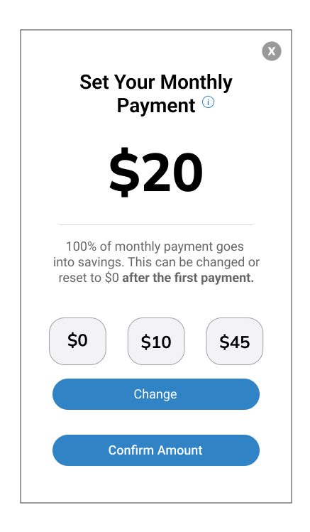
1B The New design for the Savings commitment screen.
This design made it imeaditaly fimmiular feeling to the user
After looking at competitors’ applications, payment applications, and similar flows, the team decided to base this interaction on a tip screen (see Fig. 1b). We selected options that we believed were most relevant. This approach allows users to choose from pre-selected amounts to guide them toward an optimal savings commitment. Users also have the option to enter a custom amount; however, if this amount exceeds the ideal range, the application will issue a warning. This warning will inform users that exceeding the recommended amount may negatively impact their credit and suggest that lowering the amount could be beneficial. The new designs were reviewed with the product team which included the Founder of Credit Strong as well as the President. Overall the feedback was positive and the screen was green light to move into production. After one month of being out in the wild, the team witnessed an impressive increase of $350,000 in deposits which translates into more working capital for the bank. For the users, it’s a better situation as well. The choice they make here has a massive bearing on how the credit line will be reported to Credit Burroughs. For a full video walkthrough see the top of the screen.
Adjustments post update
The last post-launch change was to add a tile to the top of the user dashboard letting existing users know about Revovl. The top portion of the dash contained a welcome message to the user. This message never changed and didn't add any value for the customer or the business. I wanted to re-purpose this space to announce new products to existing users who may have bypassed the main site. I also coordinated with the email marketer to craft emails sent out to 700K registered users to announce Revolv. The email leads them to the CTA at the top of their dashboard.
This change netted us around 30 new accounts a day from customers familiar with the Credit Strong Products. With a CAC of around $55 to get net new customers making this one change saved the company about $1,650 in CAC per day plus adding about $3000 on average a day across the business earnings. $3,000 a day in increased revenue is equal to just over one million dollars annually ( based on 2 months of data).
Conclusion
The final strategic adjustment after the launch involved adding a dynamic tile at the top of the user dashboard to inform existing users about Revolv (see Fig 1c). Previously, this section displayed a static welcome message, which provided little value to both the users and the company. I repurposed this valuable space to announce new products to existing users who may have missed them on the main site. Additionally, I collaborated with the email marketing team to design impactful communications sent to 700,000 registered users about Revolv, directing them to engage with the new call-to-action prominently featured at the top of their dashboards.


