

The Current Designs of Cadence
Click to enlarge
Clean design is the hallmark of cadence.
The Objective
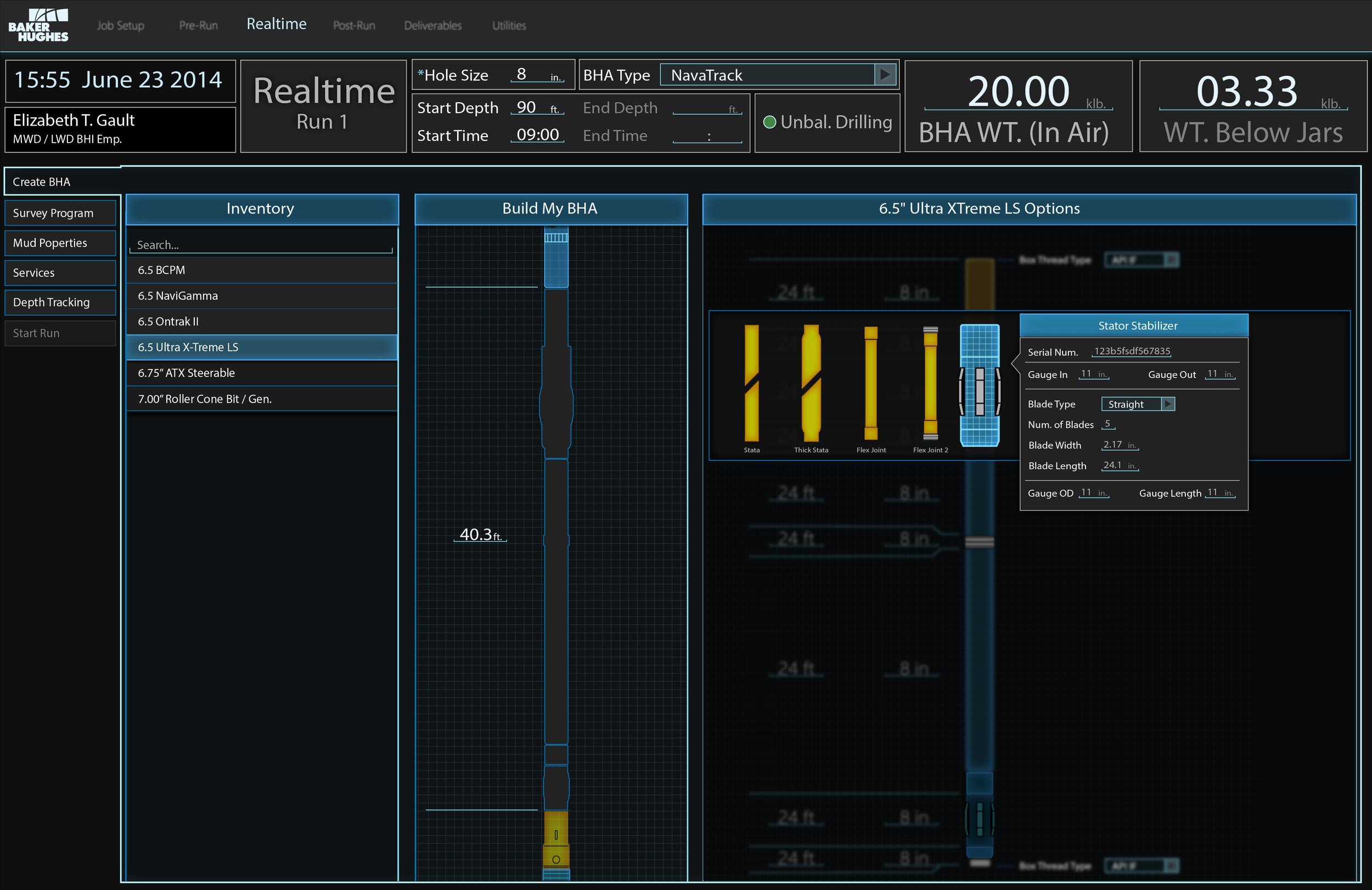
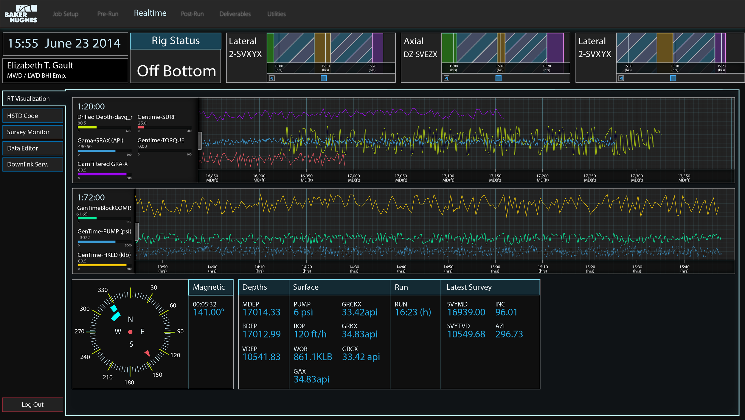
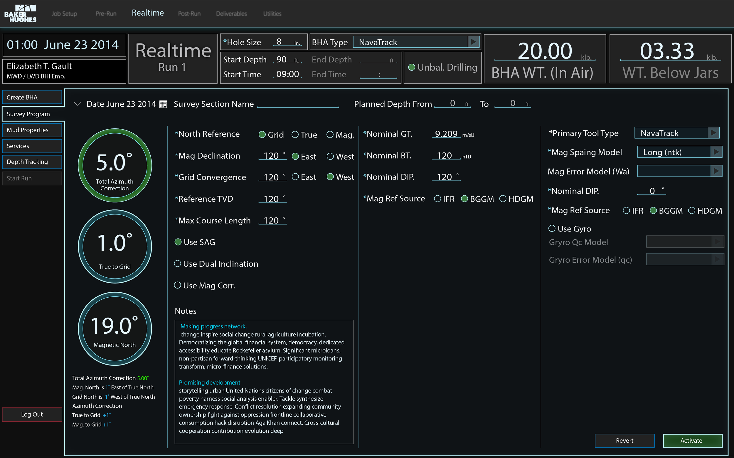
Explore what the interface could look like if it was more modern.
Dark color Scheme ( Requested by Directional Drillers on the night shift)
My Role
UX / UI designer
Scope of this case study: Design a POC using the above objectives.
Industry Jargon you may need to know to make it all make sense.
FSE: Field Service Engineer
Dumb Iron: Anything that has no sensors in it.
BHA: Bottom Hole Assembly. The tool string from the bit back to the dumb Iron.
Understanding the Domain
Rig Life!
To truly understand the domain of the petroleum and natural gas industry, you must leave the office and dive into the environment. I needed to talk to the users, to see what their daily hustle was like. I wanted to see what exactly the various jobs entail. So bags were packed, steel toes where bought, and fireproof coveralls were issued.
During my visits, I got a tour of the rig to see how it all comes together. I was excited to head out to a live platform since its a part of the oil industry you don't often see. I sat with the engineers while they used a beta version of Cadence and asked questions and observed.
I completed my 9 hour day shadowing one of the FSE's and returned to the office with a holistic understanding of the challenges that the FSE's face. One or the things I was asked more times than I can count was ‘ Can we please have a dark theme”.
I decided to design some POC screens that took the UI in a new darker direction while still adhering to the usability standards that Cadence has. The Major one being that there are a lot of color blind people working in the oil industry. I chose colors that would be legible and work together.
This was an exploration in design, a look forward to what Cadence could be at some point. This is where I wanted to let all these ideas that where swirling around in my head free. The reaction was positive from the Directional drillers, and FSE’s I showed it too.


